A few months ago, my keyboard broke. Is it related to me dropping coffee on it? Perhaps, but that's not the point. I had been using a CODE keyboard for about 2 years now, it was a really good experience. My only regret being buying the 104-key version instead of the 87 one back then
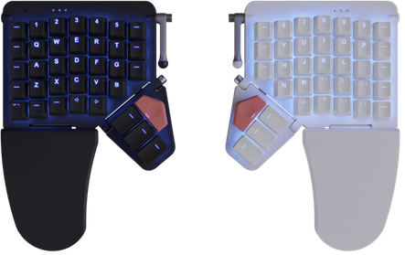
It's a really good keyboard that I recommend a lot if normal looking keyboards are what you're after because today we're gonna be talking about the Moonlander by ZSA, a clearly not normal looking keyboard

Available in two colors!
What firstgot me into ergonomic keyboards is mainly that these past few years I've been getting intermittent wrists issues. Nothing huge but still annoying once in a while, luckily just taking breaks and doing wrist exercises was enough to fix them, but I wanted to prevent them from happening in the first place (or least, delay the inevitable as much as possible)
I first started with a Microsoft Natural Ergonomic Keyboard 4000 provided by my previous job. I ended up liking it a lot! It was really comfortable and I got used to it really quickly. Also, the 1234 keys at the top were pretty useful for switching between workspaces on my tilling window manager
However I still needed an option for at home and I felt like I spend enough time on a computer every day that I can afford more expensive options and so after looking a bit around I decided to get a Moonlander
And well, to resume quickly before going in: It's good, but, I personally do not like it all that much all things considered. Or at least, I'm very unsure about it. It's very cool, has a lot of cool features, Oryx and the other tools provided works really well but it sliding around my desk turns out to be fairly frustating and it definitely takes a long time before finding "the perfect layout" (if it exists)
Build Quality
The Moonlander is an expensive product, it cost me close to 450$CAD total including handling fees, taxes and stuff and so, for this price I think it's reasonable to expect really good build quality.
The keyboard is kinda light compared to my previous one and the rubber things under it to avoid it slipping are not really good I feel like? Or perhaps they're not at the right spot, I don't know but the result is that the keyboard move a lot on my desk. I mostly fixed this issue by buying a deskpad (I always wanted one anyway) but it still does move quite a bit, which I find kinda frustating
Additionally, I would have liked for the keyboard to ship with perhaps a coiled TRRS cable as the one shipping with it is fairly rigid. I don't know how they do the fancy round thing in the marketing images as I certainly can't do that or at least, clearly not as neatly
Outside of that, it does feels well made. It being very light and small make it seems a bit fragile at times but I think it's just an impression
Ergonomics and comfort
The wrist supports are surprisingly comfortable unlike what one might think (They're made of plastic) but at least for me they should have been a little bit larger because often times parts of my hands fall off and it led to a fairly uncomfortable position
Something often cited in other reviews is the thumb clusters keys being hard to reach and I agree completely with that, the red buttons especially are completely unreachable with a natural hand position for me (I think you're supposed to use them with your index finger??), additionally the keys under it are also relatively hard to reach, mainly the fartest one
I feel like the angle on the entire thumb cluster is suboptimal and so for the first key especially, I often press the corner of the key and kinda hurt my thumbs. However, one thing that should be noted is that the thumb clusters can be angled up and down which does help a lot depending on your hand size but still, it doesn't feel as good as it probably should. I would have loved to test the ErgoDox EZ, to see if it had the same problem as the thumb cluster on it is angled differently
[image of the thumb cluster]
The layout
I use the French Canadian QWERTY keyboard (which got recently added to Oryx, thankfully) with a few tweaks so I'm able to type in Swedish too and I don't know if I haven't got used to it enough yet or what but it's impossible for me to type accents with a natural hand position. I've tried moving things around which for sure helped but it still doesn't feel that good. In typing tests, it's where I'll make errors 99% of the time, that and punctuation
I feel like the default layout would be perfect if I were only speaking English or if I were to use an alternative keyboard layout such as COLEMAK (Though typing other languages than English on that is not optimal either). To be completely fair, I can't really blame the keyboard for that, typing three languages + Programming is definitely not easy to accommodate and the layout is easily changed through Oryx

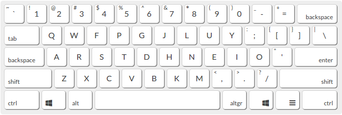
The COLEMAK layout
Talking about programming, since I use half my keys for accents, I figured that I would use a secondary layout full of various symbols needed in programming and that work really fine, however, I still haven't found a proper spot for the layout switch key. I'd use the thumb cluster but as said earlier, those keys are pretty uncomfortable to press so I'd rather avoid needing to hold them. Also, keys with secondary options on them are really visibly laggy. With the default layout, this is REALLY noticeable on Z and / which, again, isn't a problem in English since the Z key is really rarely used but is in French
But to end this on a positive note, Oryx is really complete and fun to use and I'm sure I'll eventually figure out a layout that fit my needs perfectly, it just takes a lot of time and efforts (though all the tools needed works really well). I would have liked for it to be multiple default layouts not only showcasing the features but also showing off different ways to use the keyboard to your advantage as the default layout currently available feels like it's trying to please everyone but doesn't quite succeed at it